The Doves Press Bible
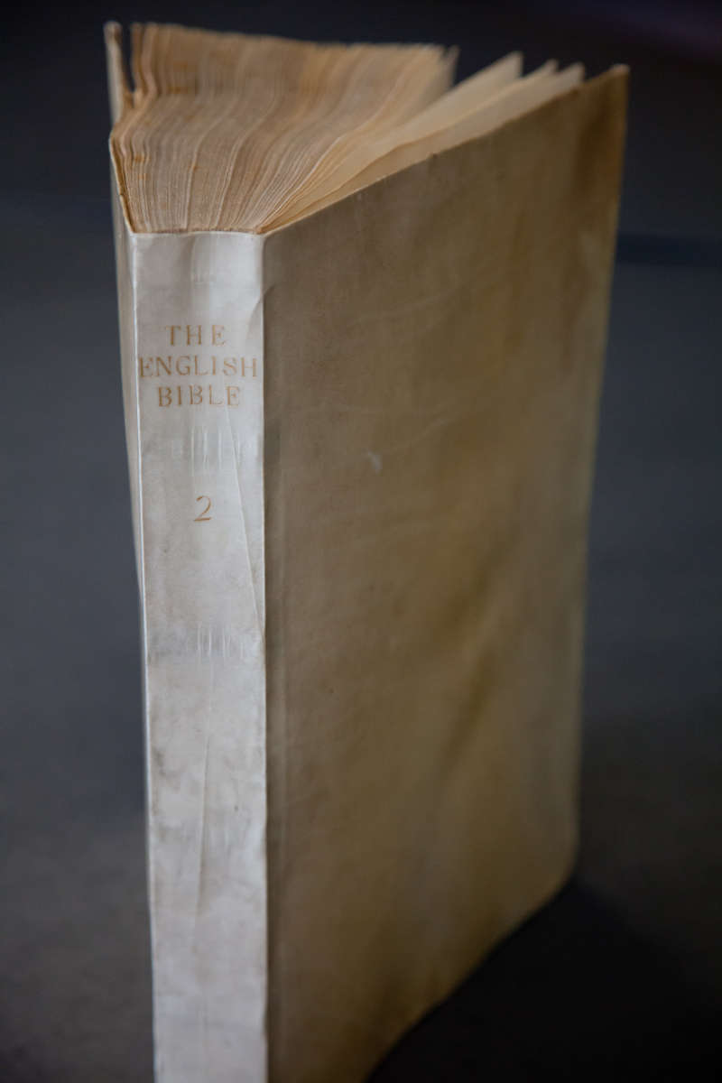
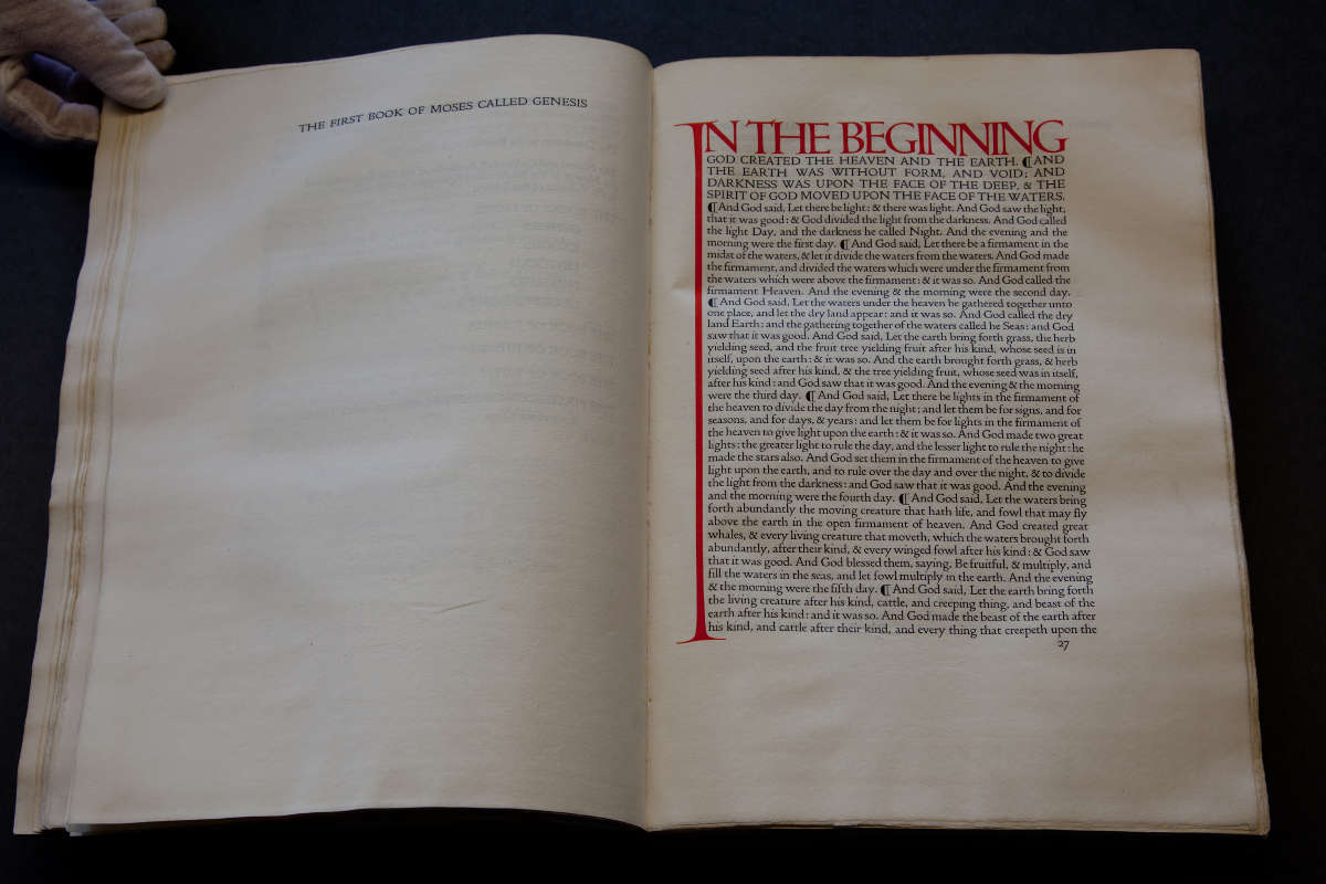
The Doves Press Bible is considered to be the Press’s crowning achievement in both typography and design. Cobden-Sanderson’s conception of the Bible was, like much of his life, unusual for the time. He was an avowed non-Christian and saw the Bible not as a religious text, but as a challenge: a means to experiment with typography and layout on a monumental scale. He wrote in his journal in 1902 that “[his] only fears should be that [he] may not live to accomplish it”. The text is set in Doves Press type, which was designed by Cobden-Sanderson and Walker and inspired by 15th and 16th century Venetian typefaces. Though pleased with the type, Walker critiqued the book’s layout, hinting the disintegrating artistic unity between the two craftsmen. In particular, he disapproved of the extended capital “I” reaching from the first line down to the very bottom of the page, now considered its most innovative aspect. Though devoid of imagery and ornamentation, Cobden-Sanderson’s design finds an expressive power in the slender line linking the top and bottom of the page, as if to demonstrate through typography the link between heaven and earth.